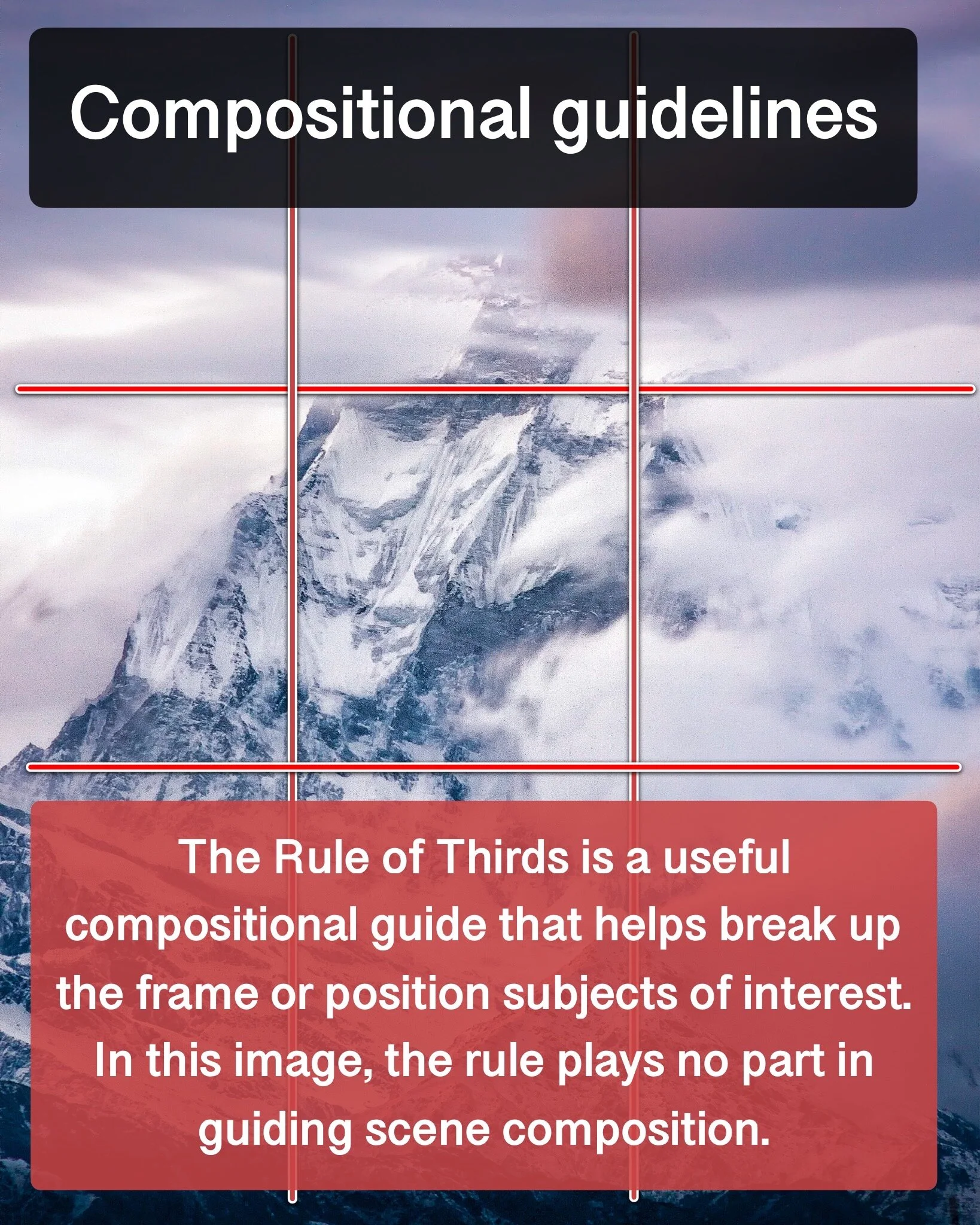
Scroll to see how we can make this image better.


Photography, like any other craft, requires practice and repetition to hone and perfect. The more time one puts in to working on making images, the better one becomes at spotting what works and what does not. For every image I create that I am happy with, there are dozens that will never make it to my portfolio or be shared for others to see. Over the past 8 years, there have been, quite literally, hundreds of frames that have ended up on the proverbial cutting floor, languishing on a hard drive in my closet.
And yet, there is much to learn from failure. What makes an image that fails to impress? What compositional choices fell short? What could have been done different? In an age in which we strive to share only our best work online, what lessons can we learn from our “not-as-good”? This is one such image, an image that will never be included in my portfolio. But maybe we can learn a few things from this image which, while not bad, is not great.
What do you think? How would you improve this image? Would you like to see more failure analysis posts like this?
Captured on the Canon 500D with the Tamron 18-200mm Di II VC lens at 176mm, 8 secs, f/13, ISO 100

